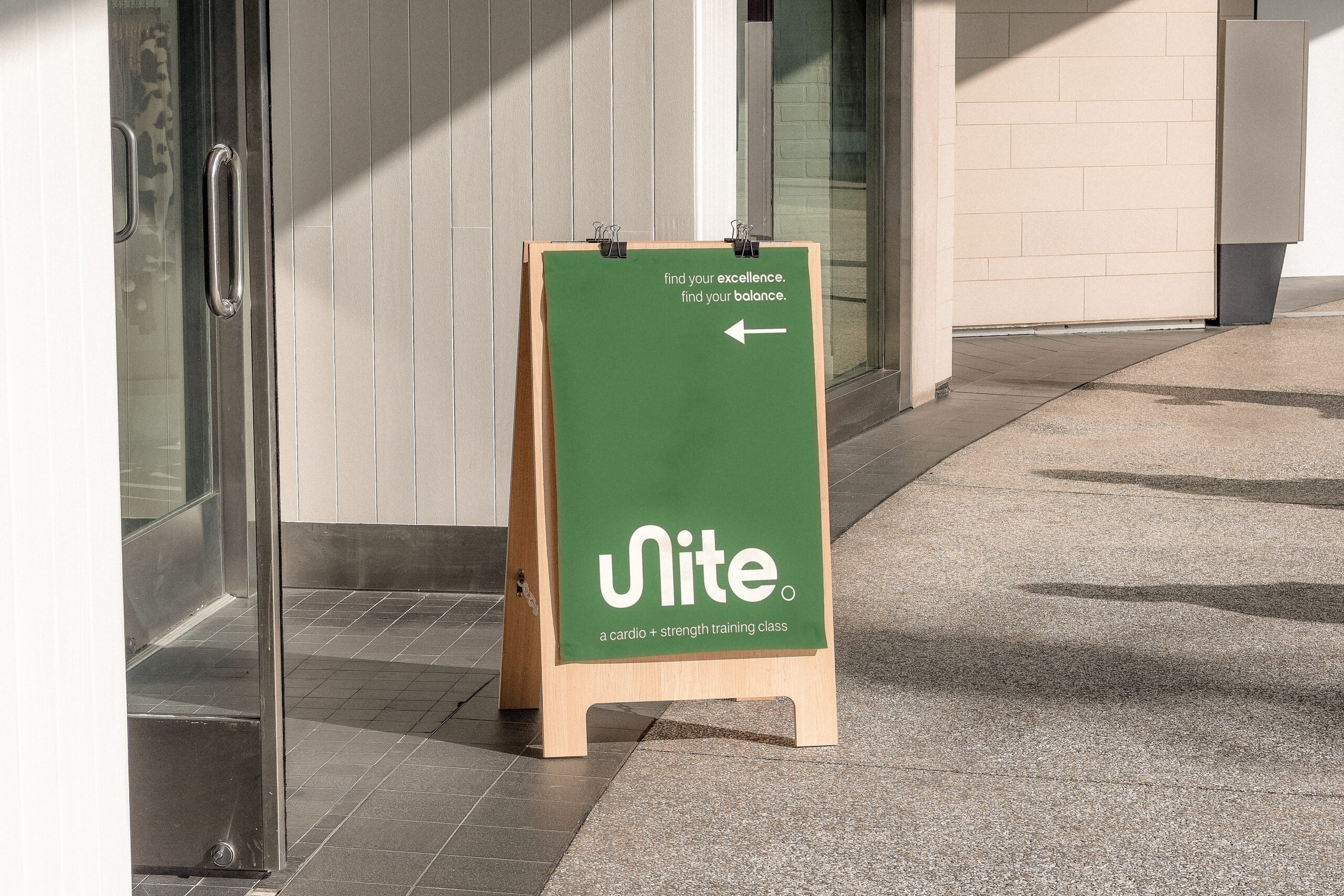
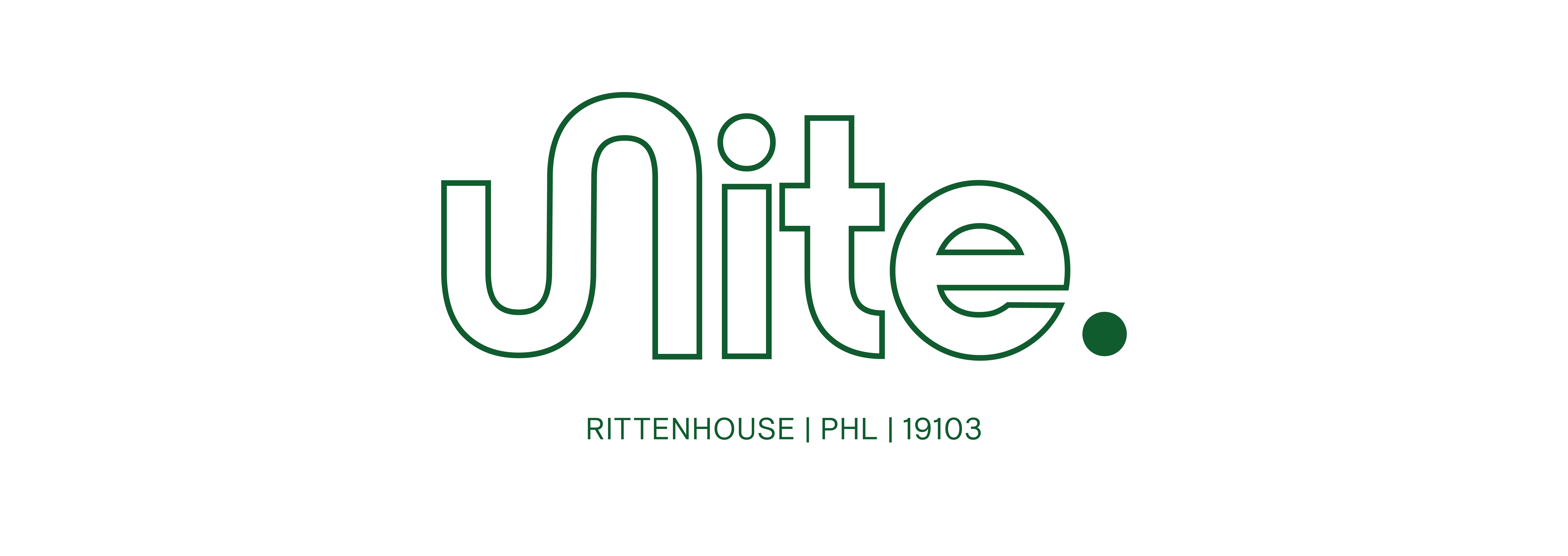

Unite Fitness Rebrand
Scope: 6 Months | Branding + Creative Direction
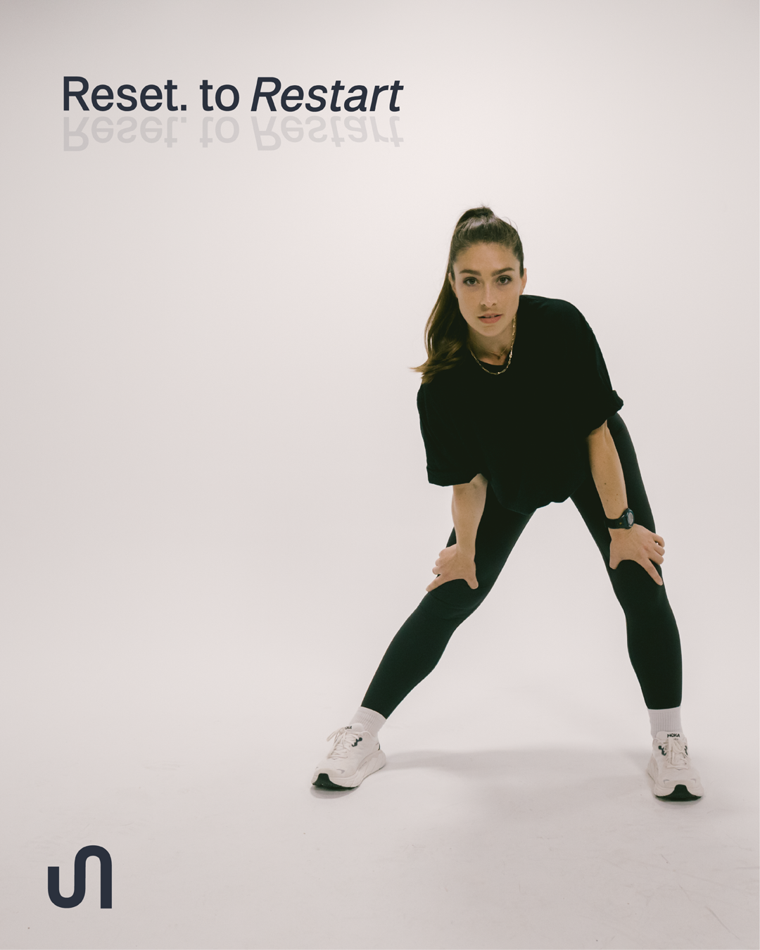
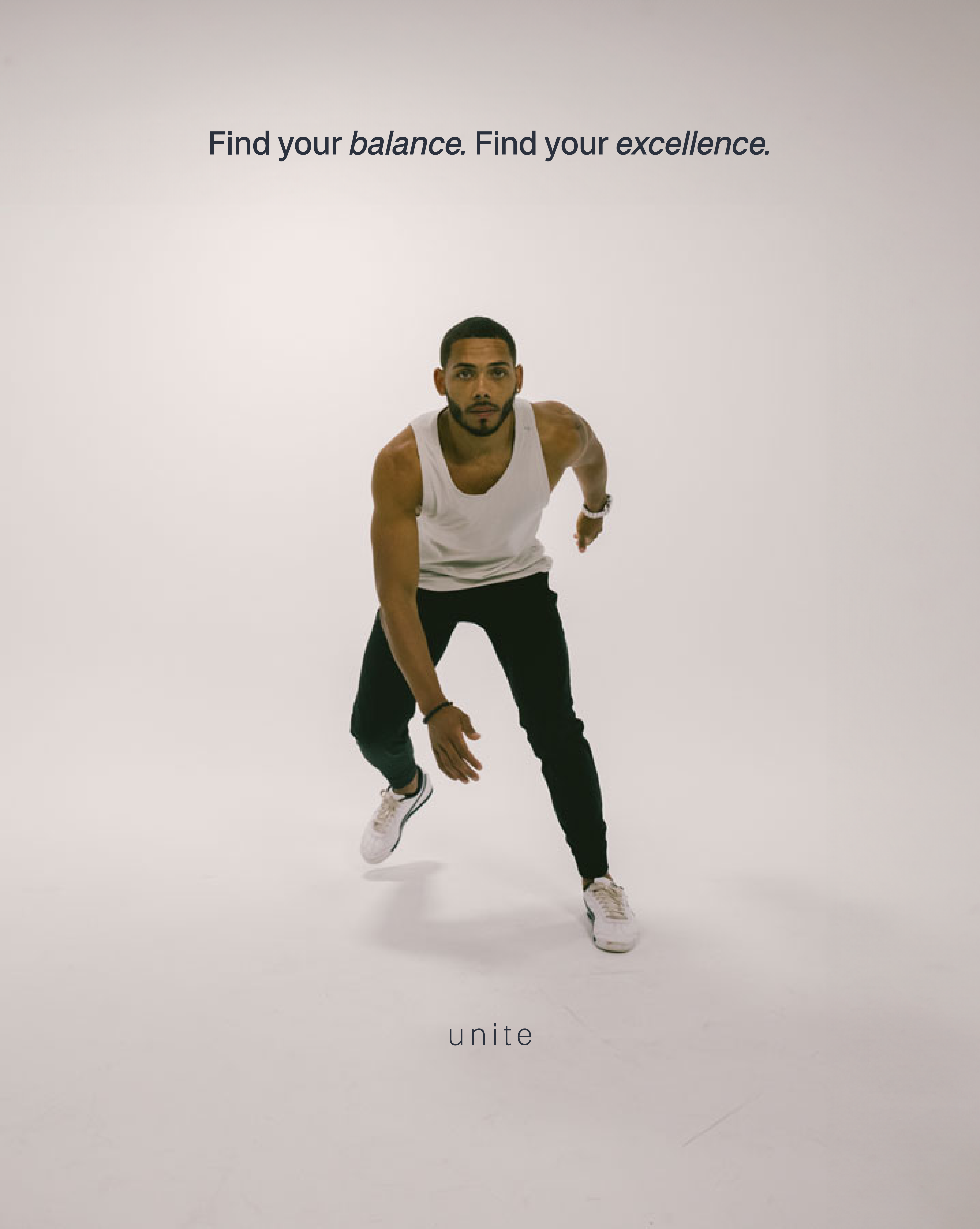
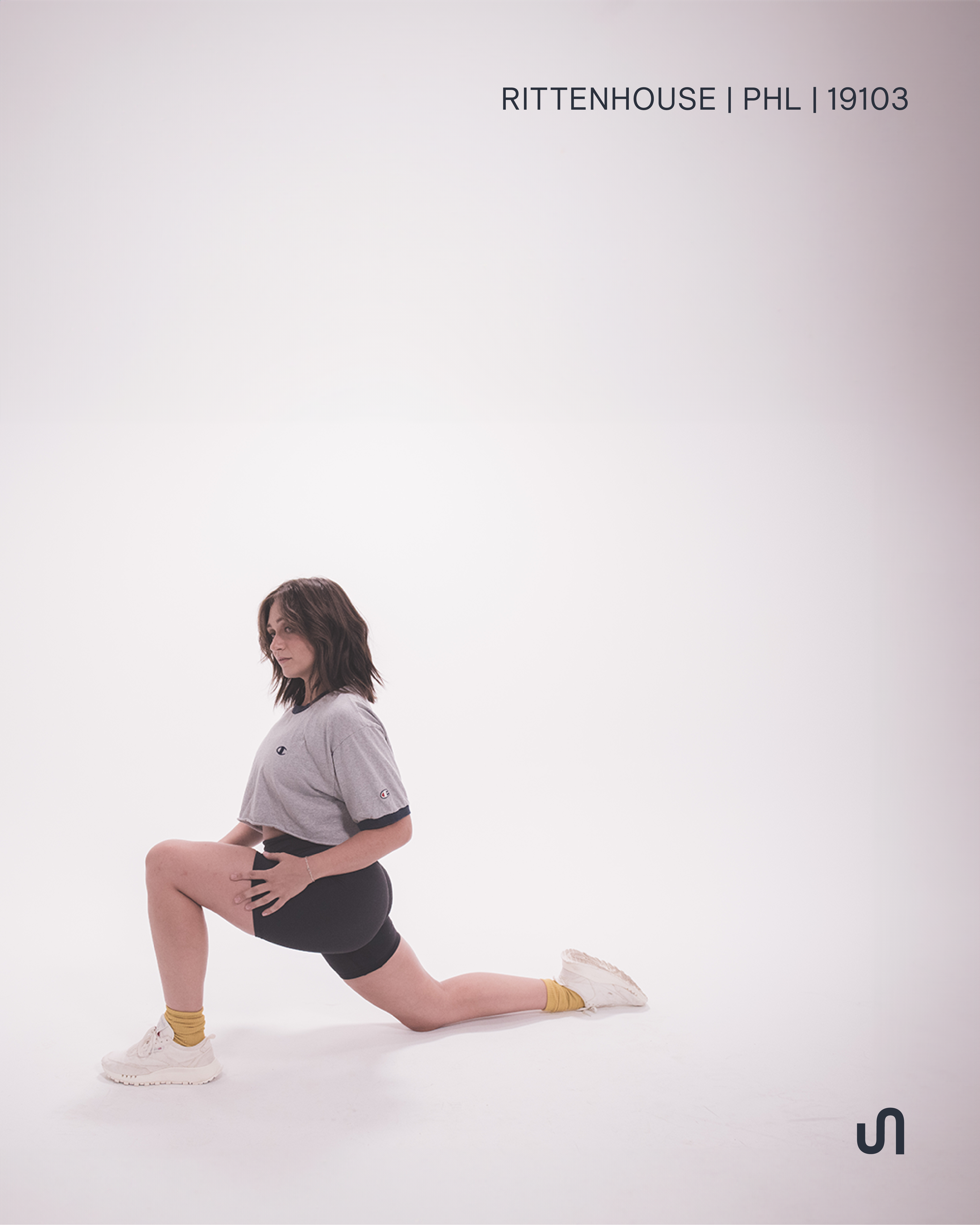
Photography: @groundfloorphilly
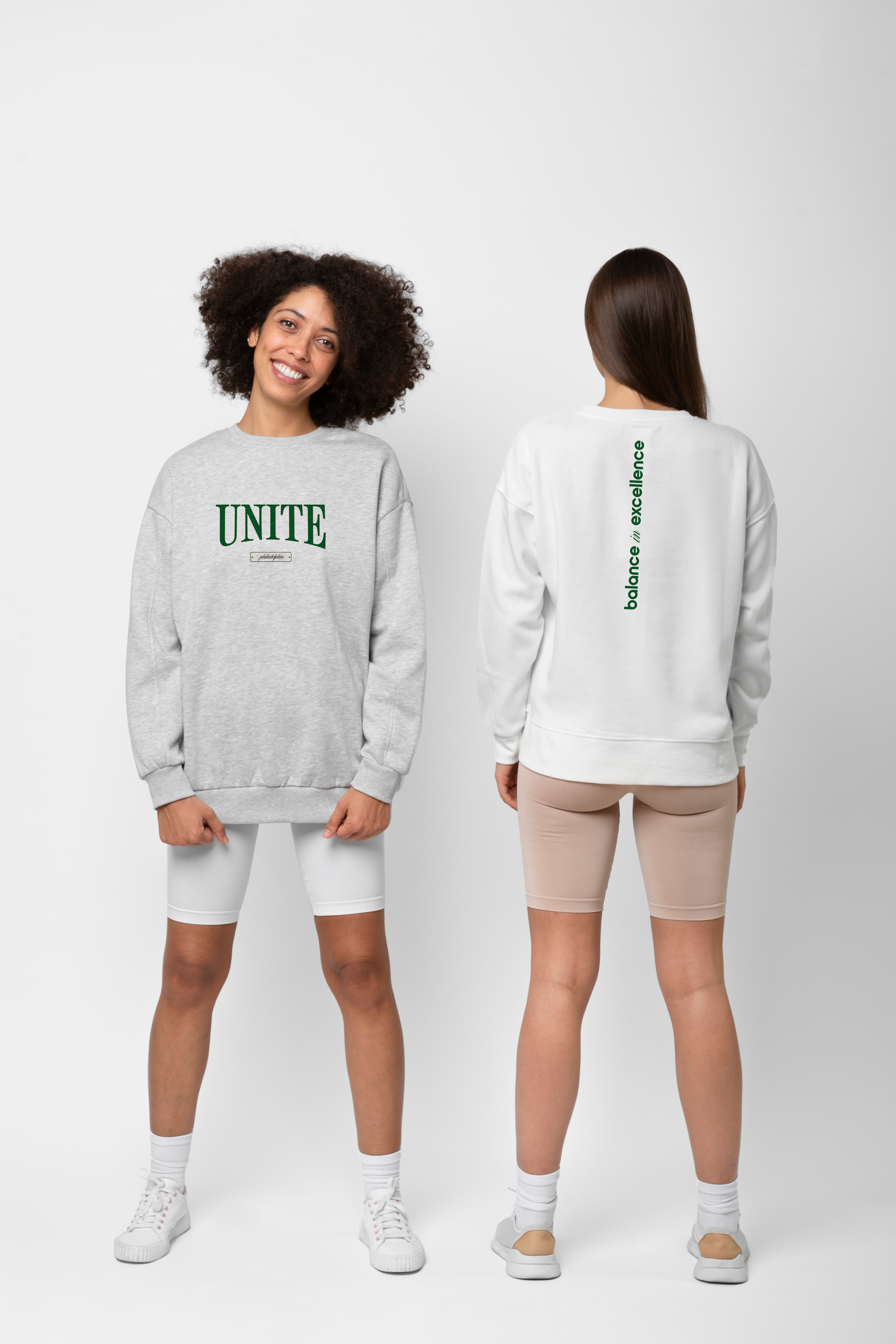
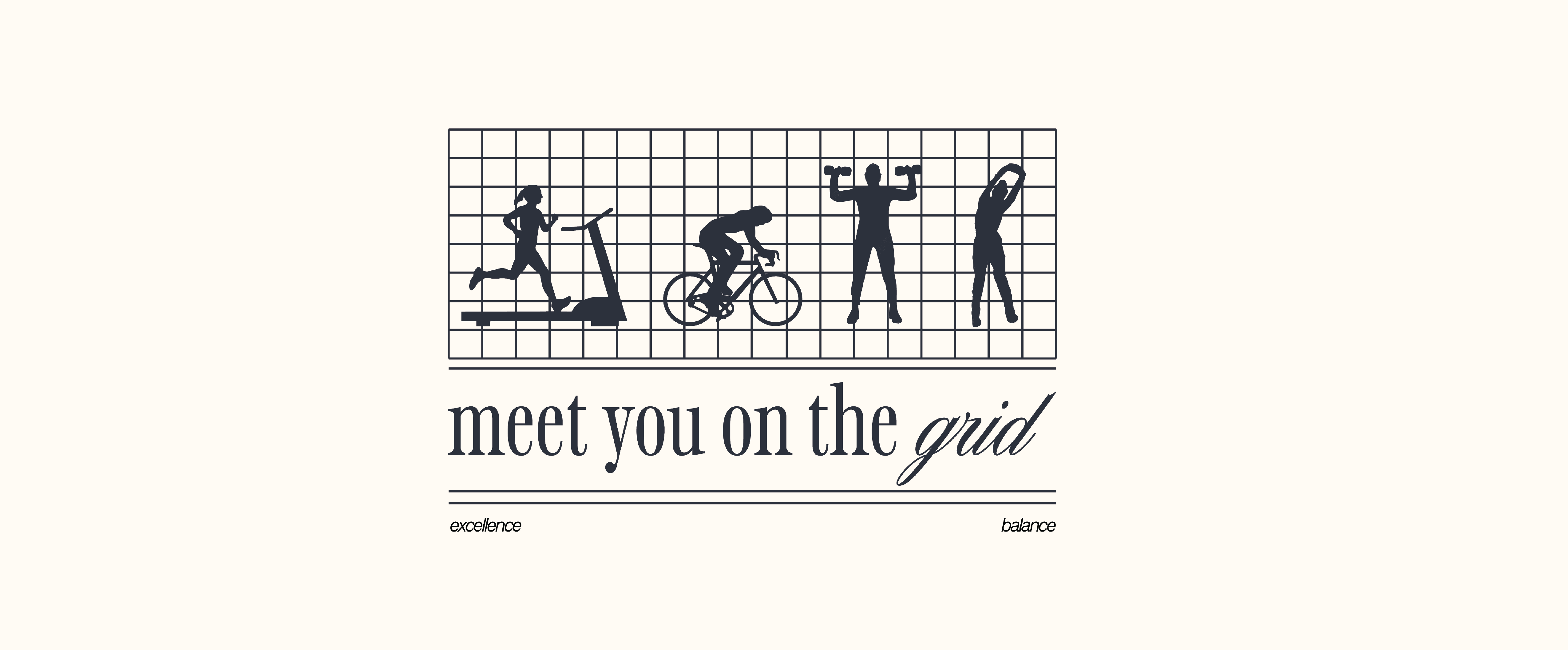
As a boutique-fitness powerhouse in the Philly fitness scene, Unite Fitness was due for an upgrade to position itself among big-name competitors, while also aligning with the post-pandemic views of balanced fitness and lifestyle regimens.
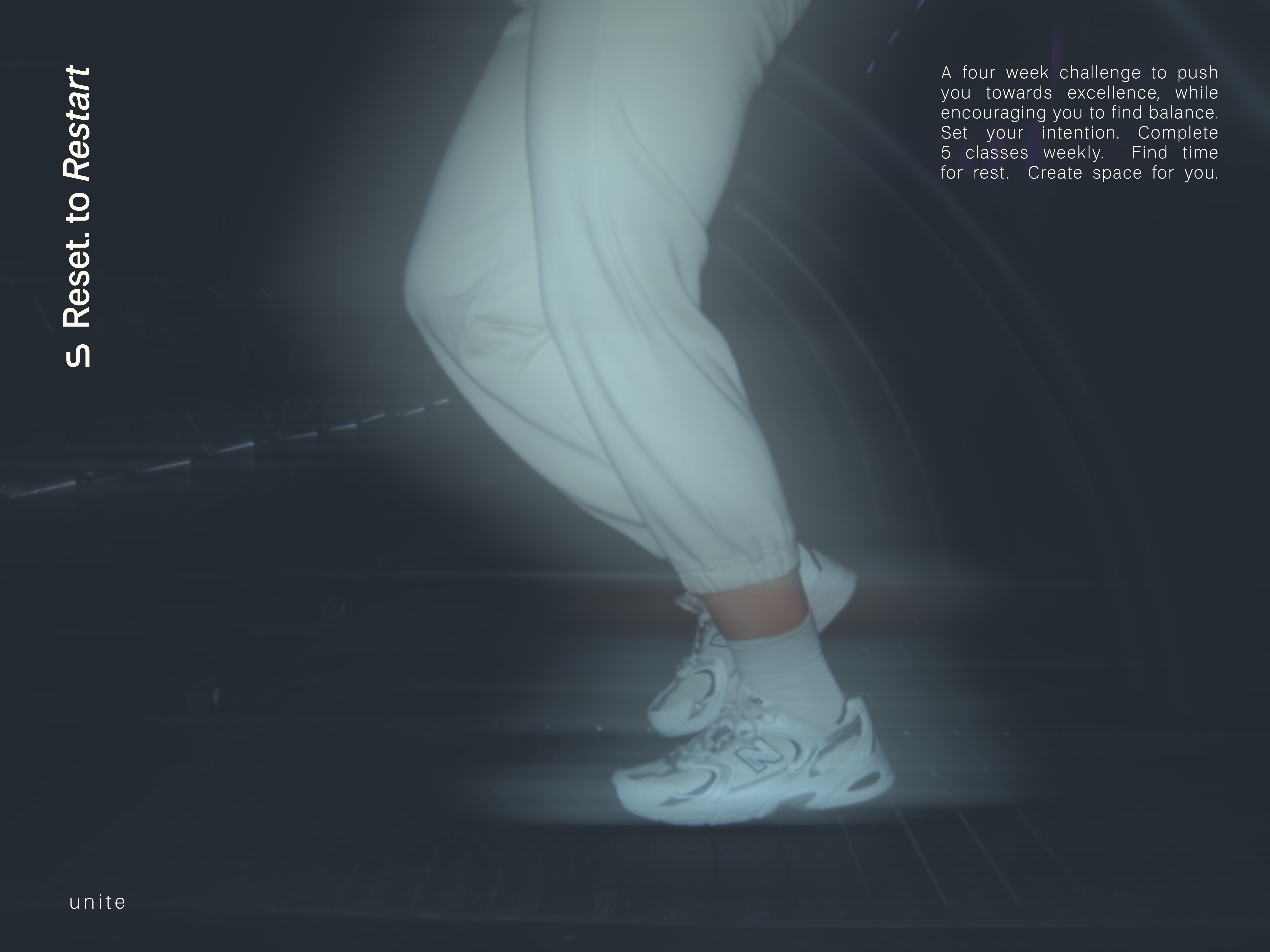
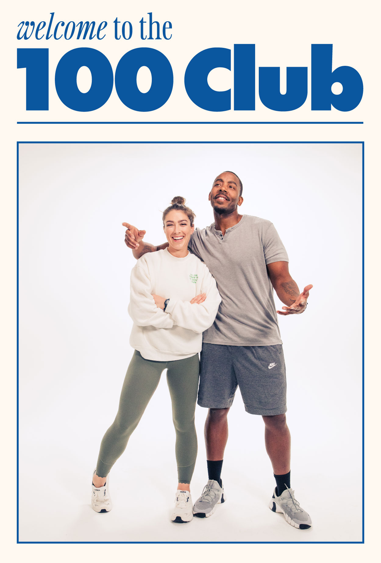
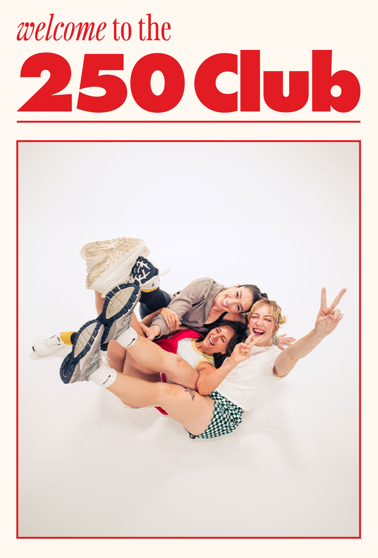
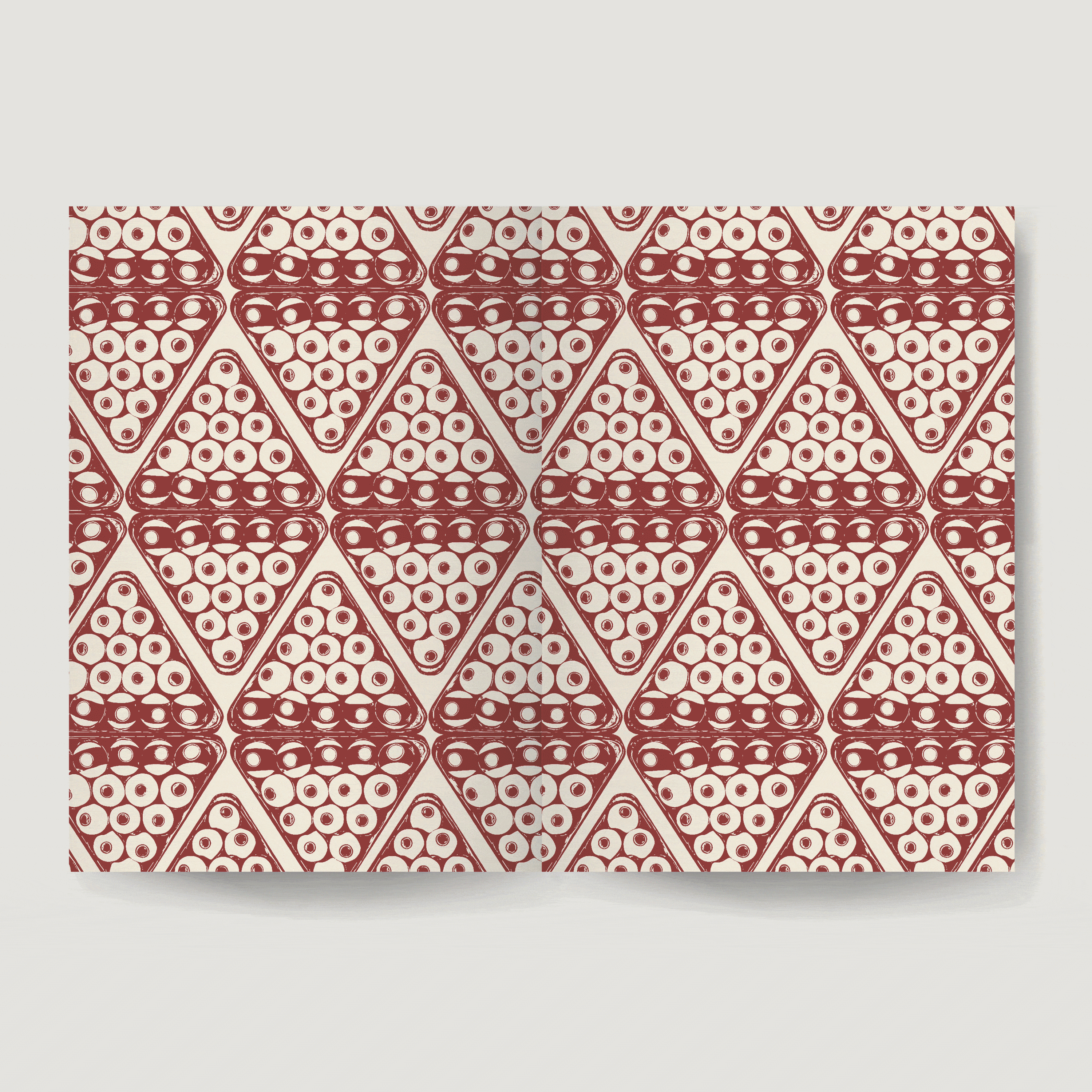
The goal of Unite's new direction was to become a less intimidating space — moving away from dark, club-like visuals and moving into an approachable, lighter, and more welcoming visual space — and become a luxury lifestyle-inspired brand. The foundations of the system are built from neutrals with accents of primary colors, timless and some swiss-inspired typographic combinations, and playful image use.