
South Philly Bikes Rebrand
Project Type: Branding
Scope: 10 weeks
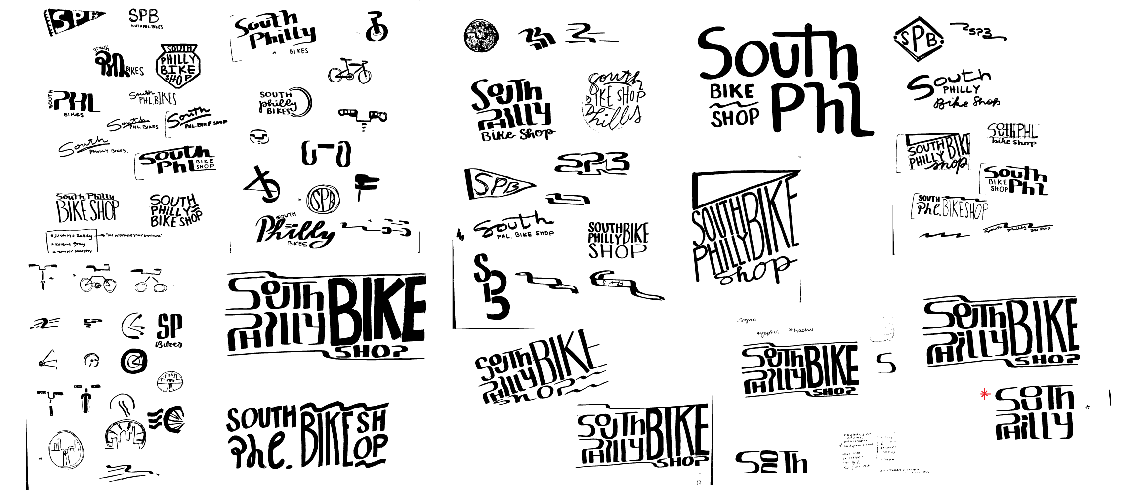
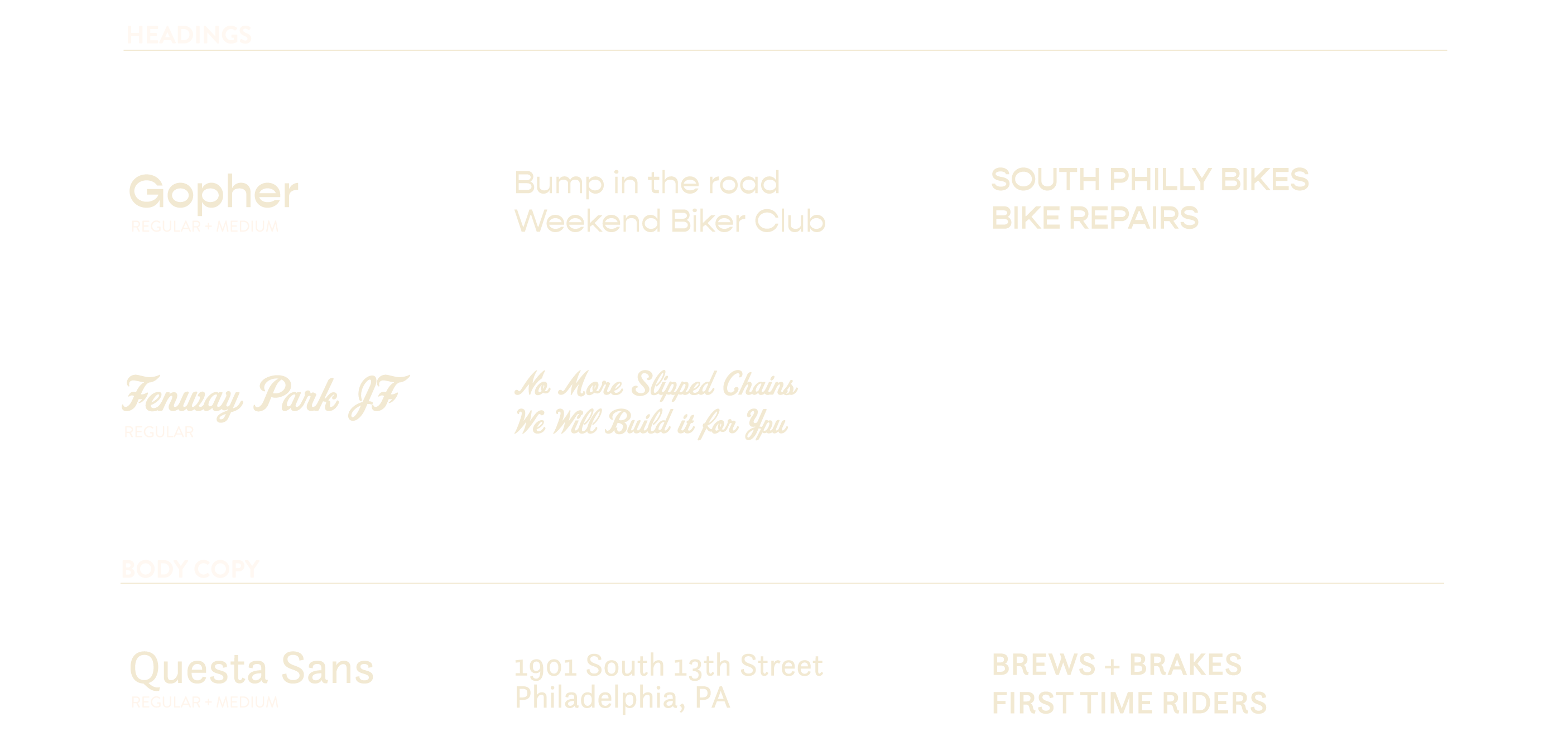
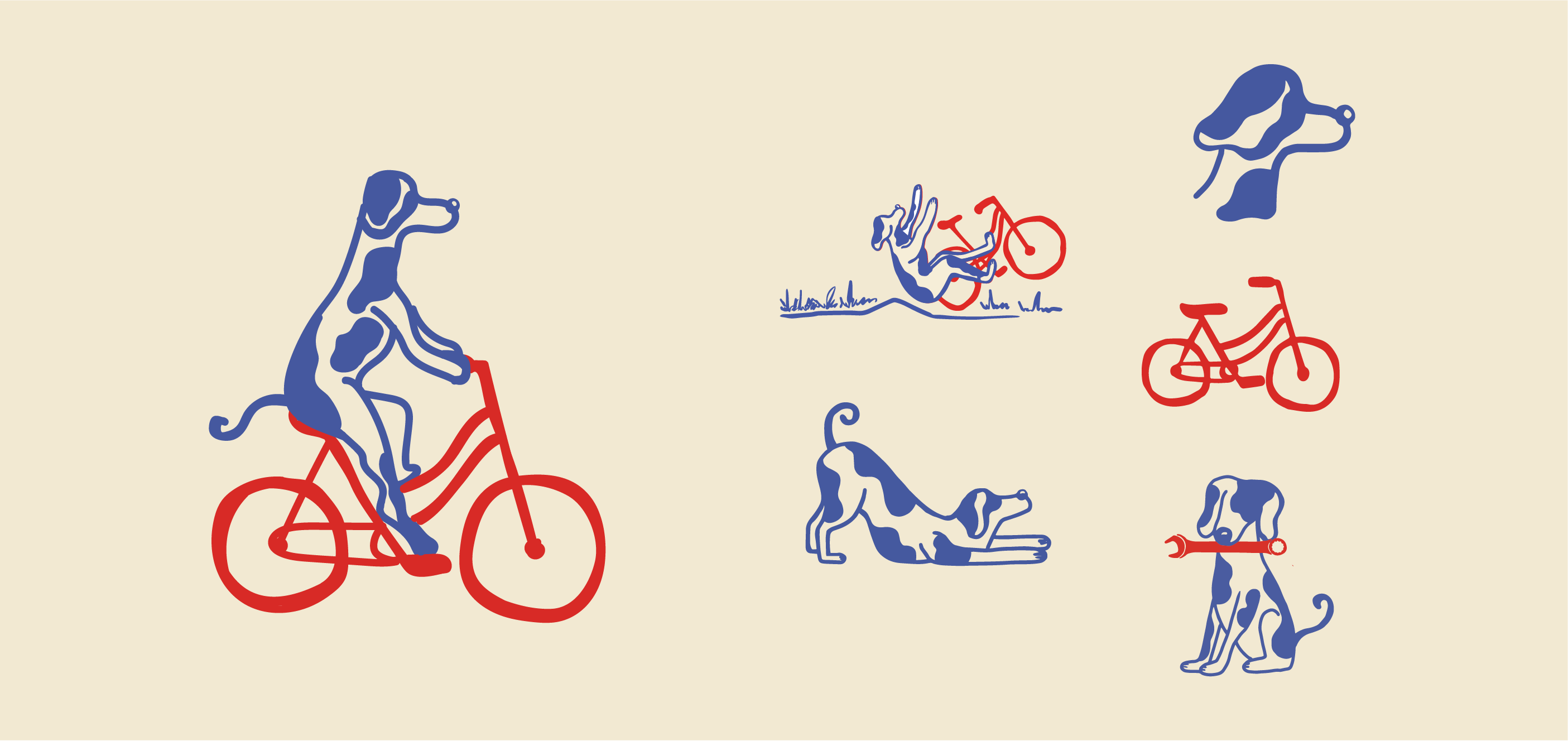
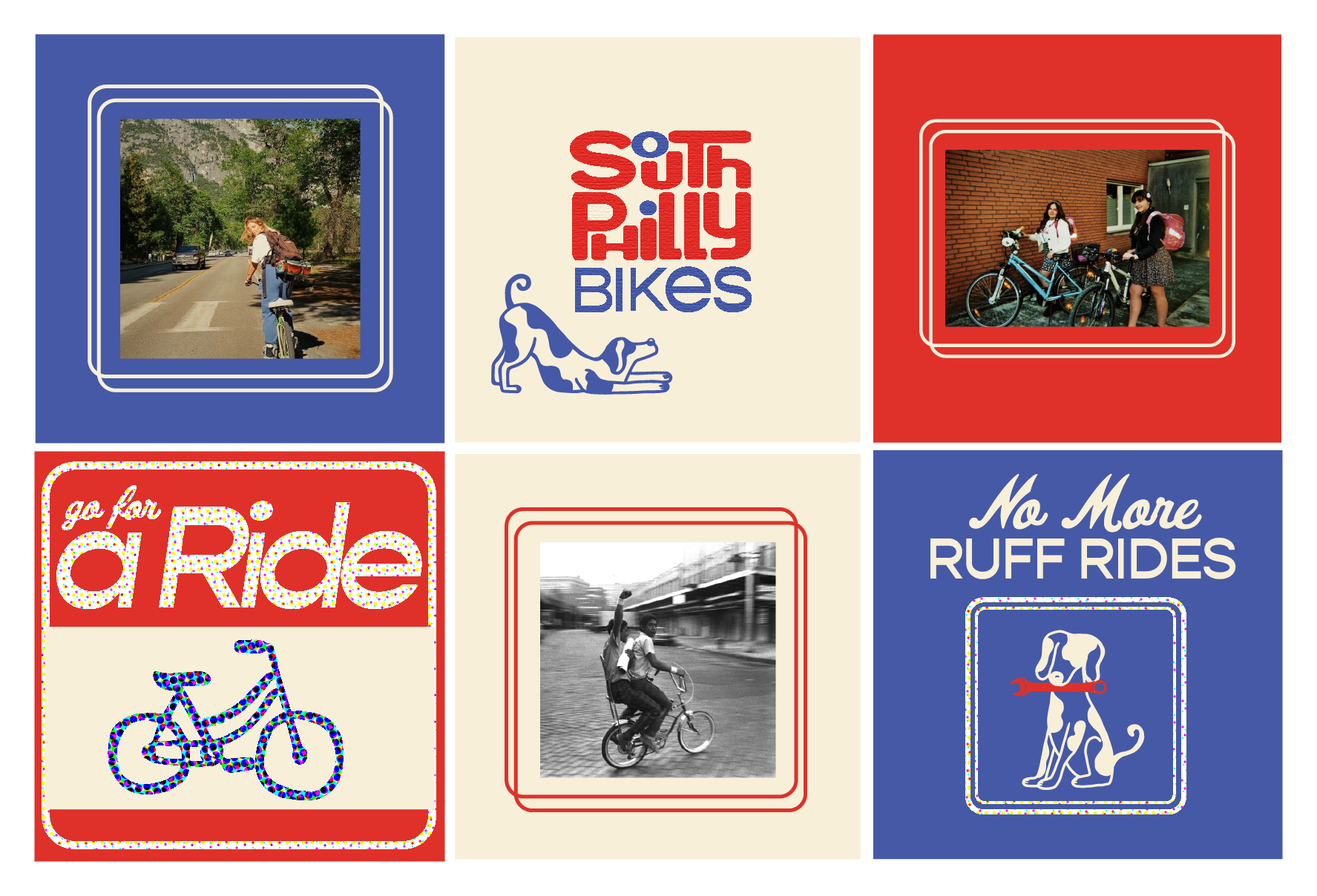
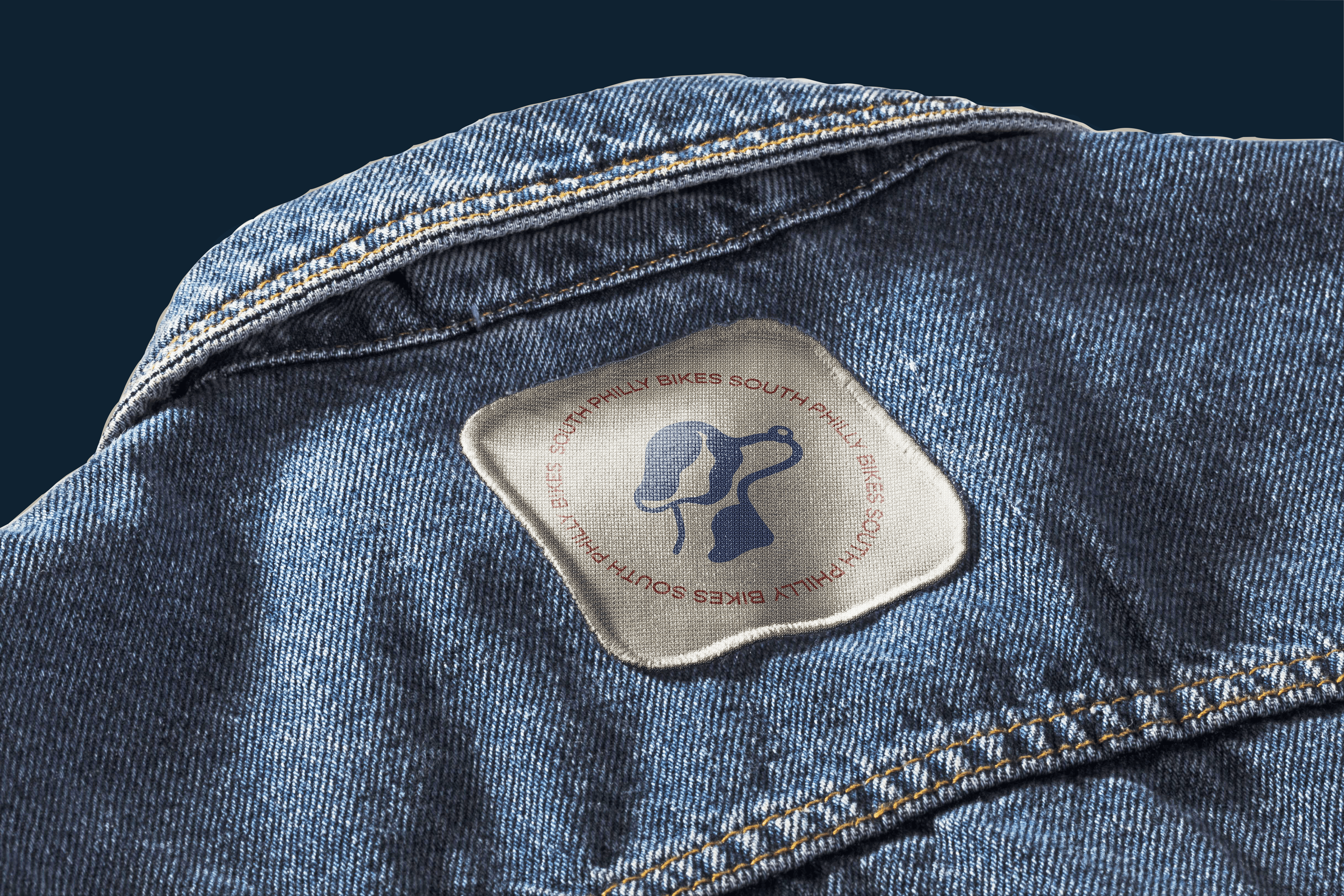
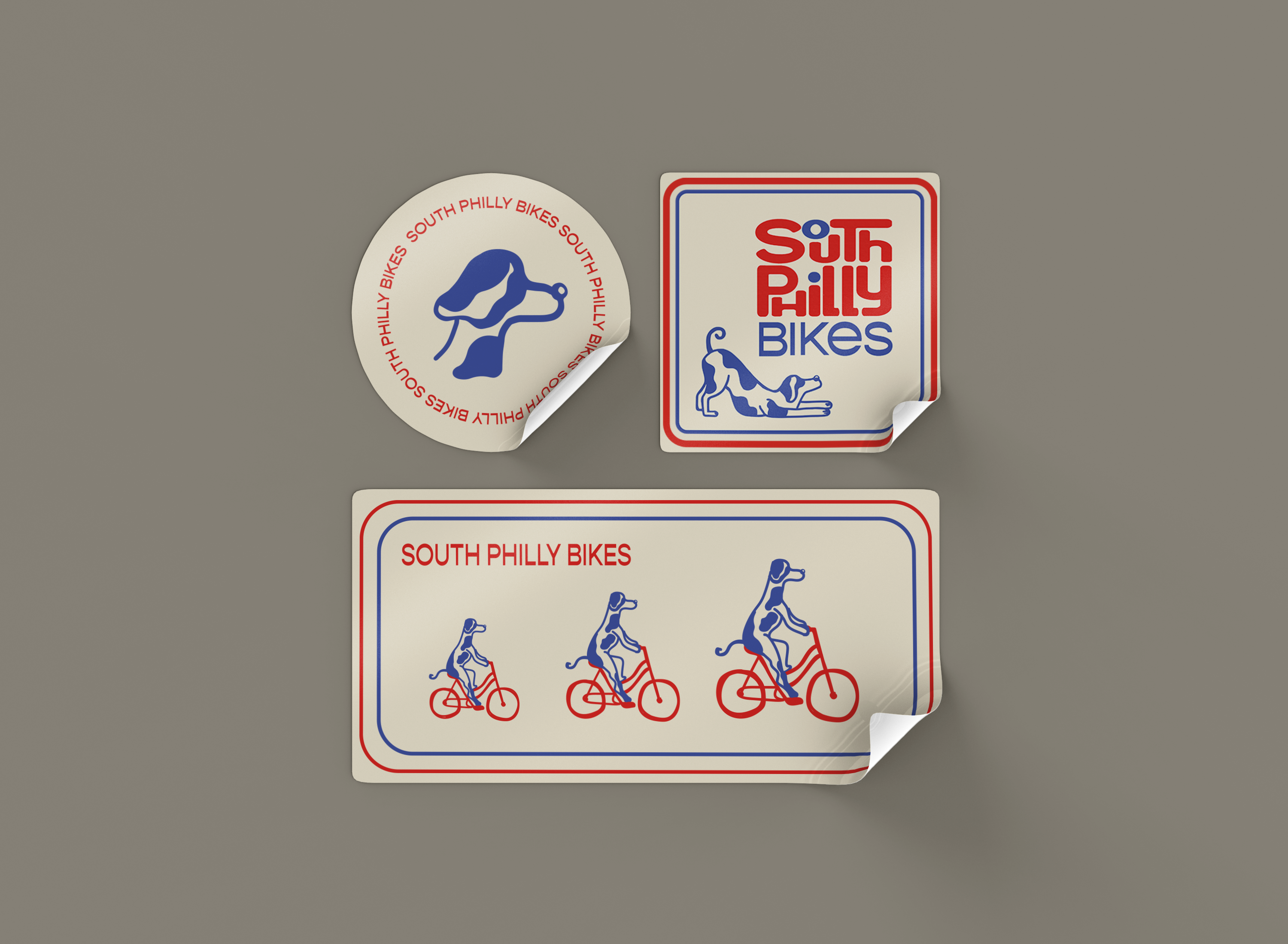
South Philly Bikes previously had an outdated and inconsistent brand and needed to be streamlined and true to the character of the South Philly neighborhood. Immediately I wanted to contemporize an Americana theme for the progressive neighborhood and found the bones of the brand concept in the classic imagery of mid-to-late 20th-century baseball. Looking at the typography of jerseys and signage of the time drew me to create a custom typographic logo which is used in combination with retro-ballpark derived typefaces. To nod to the bike shop’s actual in-shop pet, the mascot became a custom-illustrated dog, which can be seen across individual and pattern use.
Logo
Colors + Typography

Illustrative Elements
Stylization

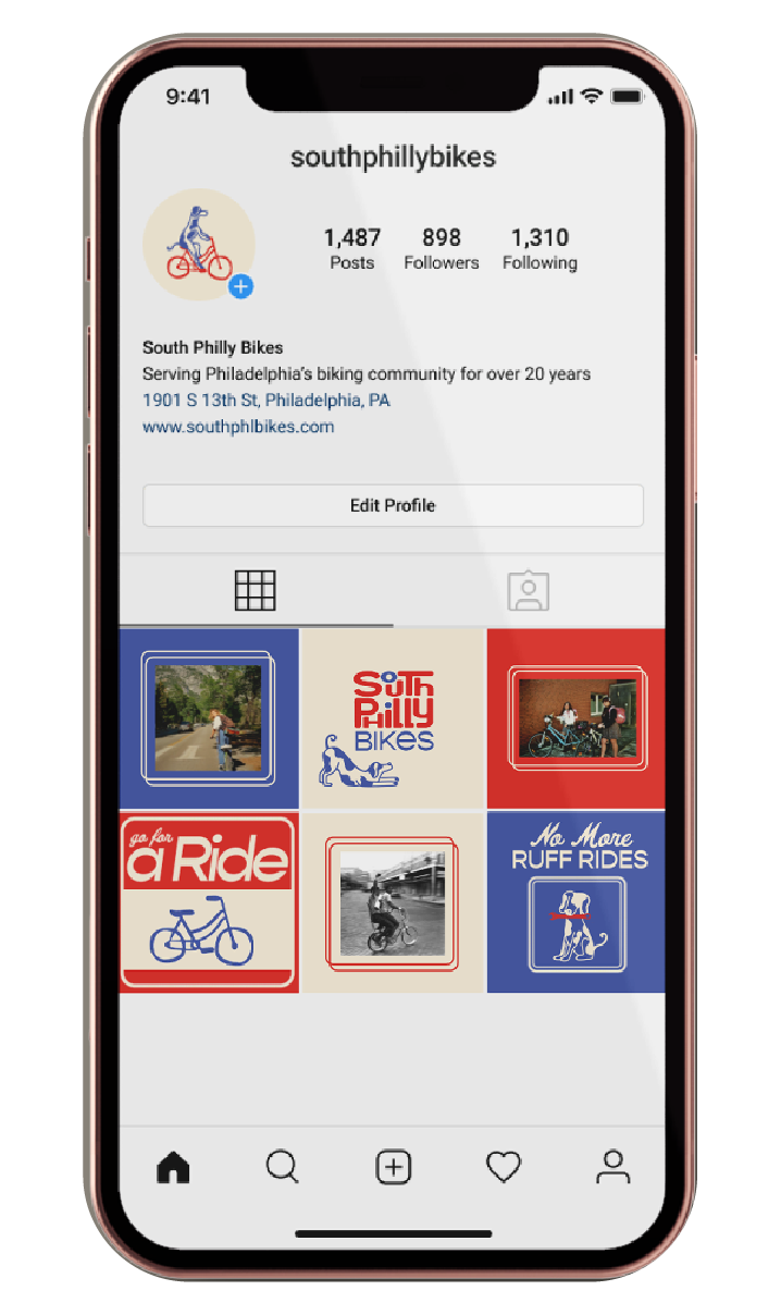
Social Media Posts
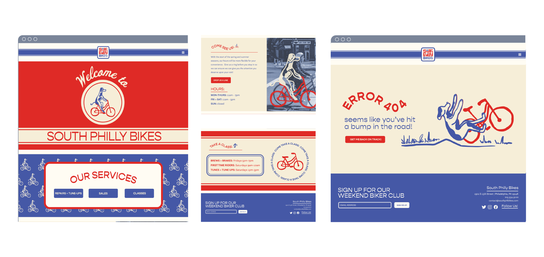
Website
Environmental Signage
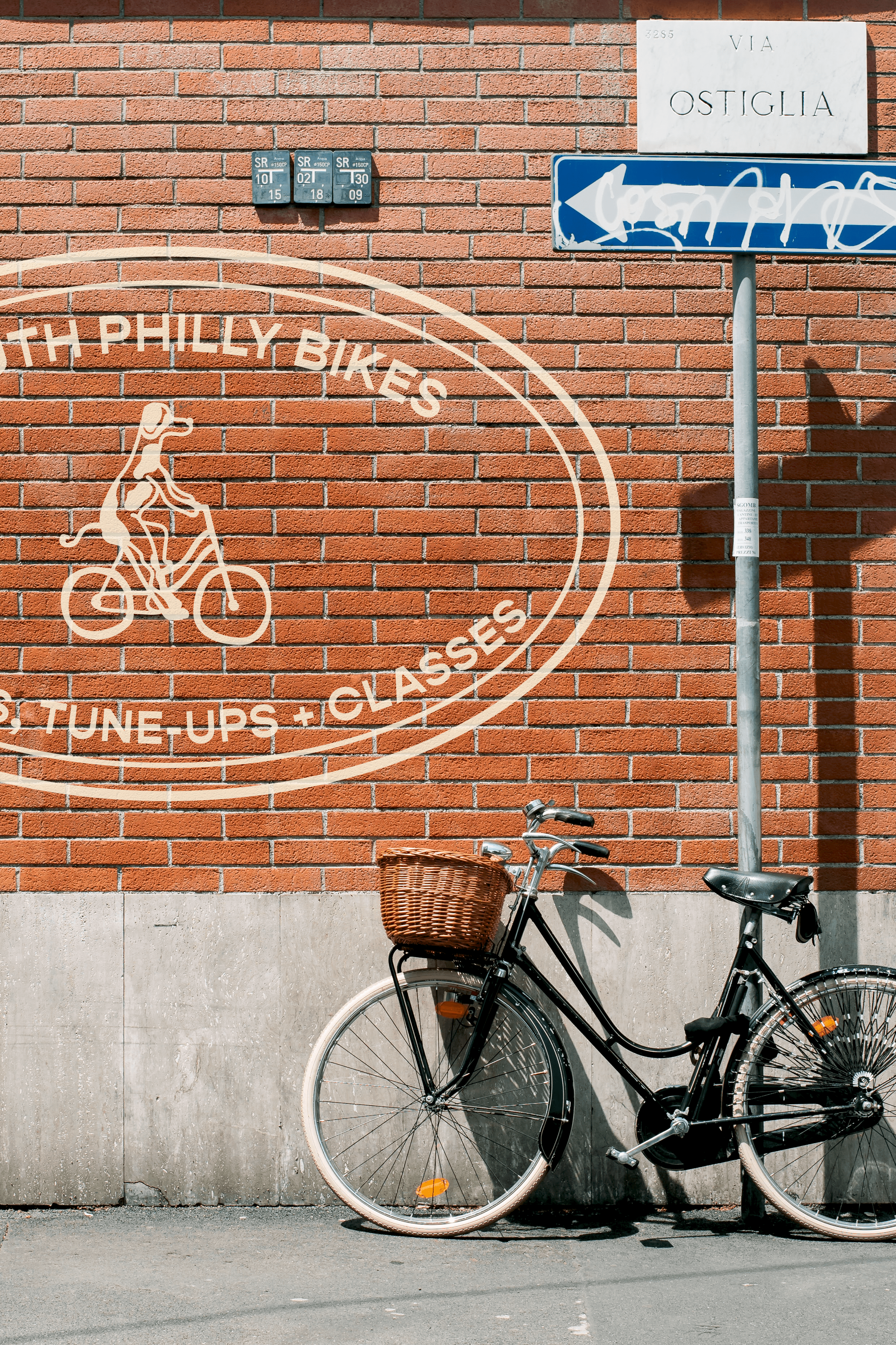
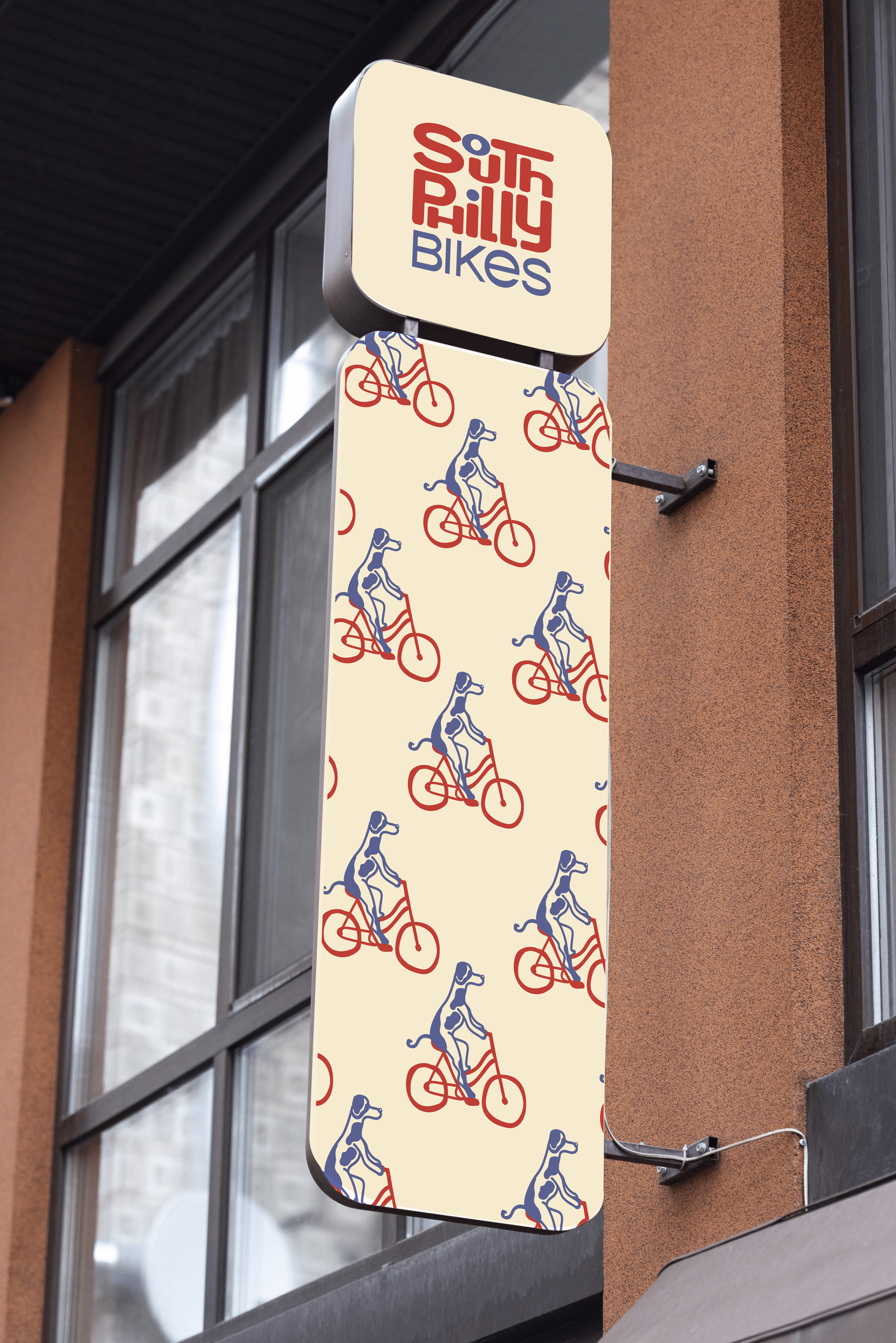
Building facade mural + shop sign
Posters
Staff Swag
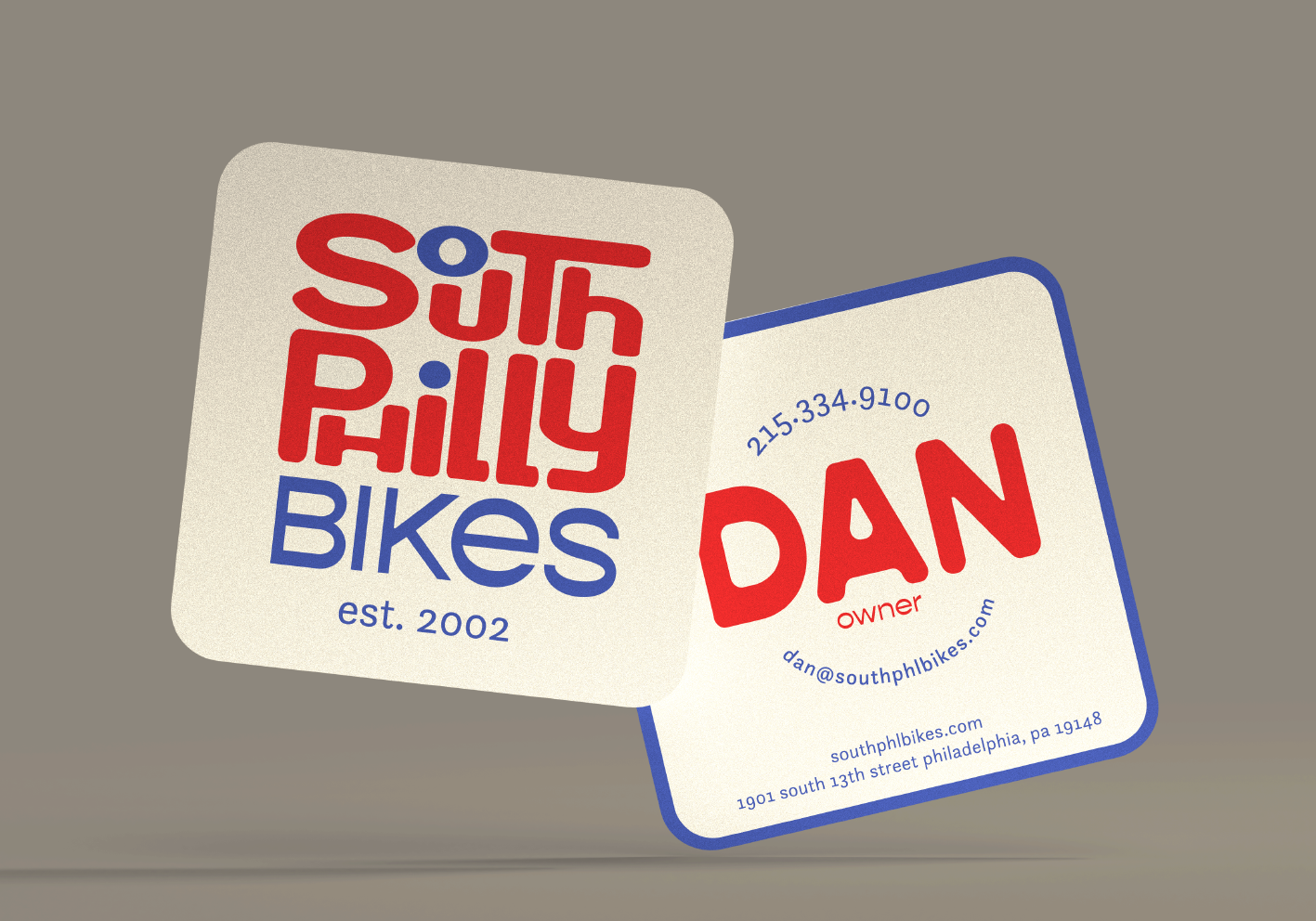
Staff uniform, business card, and name patch
Merch

Logo Sketches